Pontus Pharma is a new pharmaceutical company entering the Adriatic market. Its purpose is to improve access to healthcare for all – bringing high-quality pharmaceutical and other healthcare products which improve the health and wellbeing of their patients to the market, and to make these products accessible to every person who needs them in the Southeastern European market.
Pontus Pharma aims to bridge the gap between the current, existing healthcare standard of Southeastern Europe and developed markets. Pontus Pharma’s objective is to be perceived as a go-to for pharmaceutical companies, healthcare professionals, and patients. Pontus Pharma’s image is that of a modern, innovative, outwardly oriented company, which has a strong foundation in quality, partnership, reliability, and integrity.
Pont (gre., Πόντος [Póntos] – Pontos = "Sea", lat. Pontus – Pontus= “sea”; “wave”) is a region on the shore of the Black Sea located in the northeastern part of Turkey. It was named by the Ancient Greeks who colonised the area, and it comes from the Greek name for the Black Sea – Pontos Euxeinos (“the hospitable sea”).


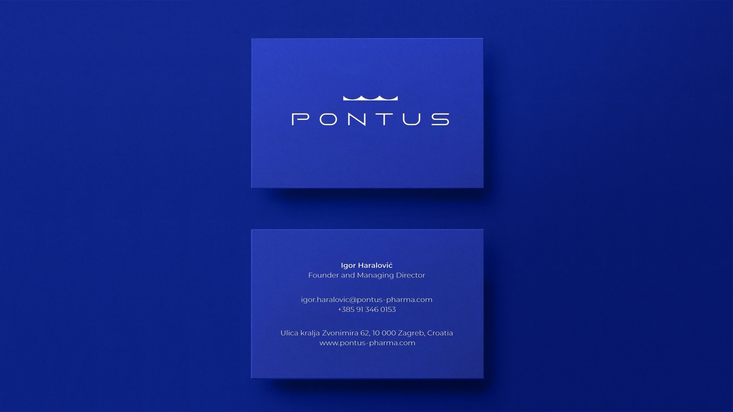
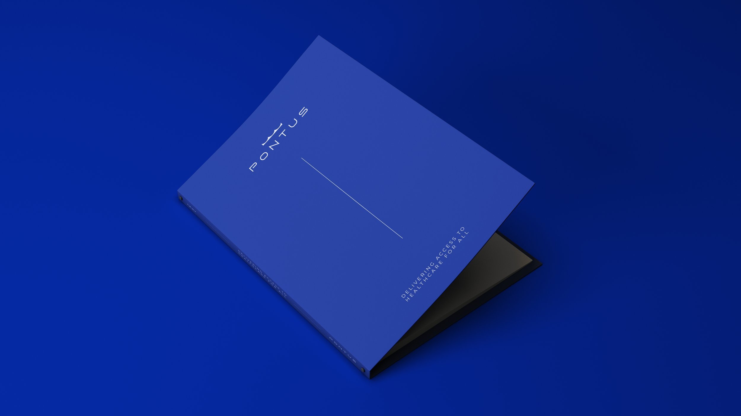
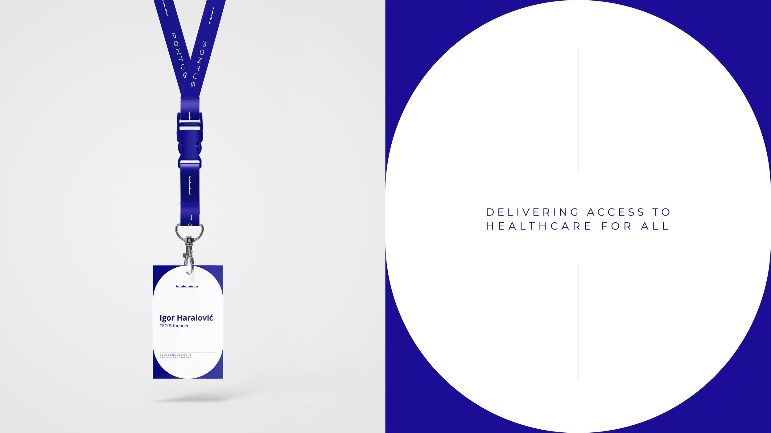
We were given the opportunity to work with Pontus Pharma to create the company’s visual identity. The client’s wish was to portray the meaning of the name visually, to show it in its full strength. Magnificent, hospitable, proud. The created logo has multiple meanings – an upside-down old bridge in Sisak, the town where the client is born and a crown (The Kingdom of Pontus). The logo is modern in style, and yet traditional, with a focus on integrity and quality. Dark blue is connected to depth, expertise, and stability, which is why it is an often-used colour in corporate visuals. The dark blue represents knowledge, power, integrity, and sincerity.


CLIENT: Pontus Pharma
ART DIRECTION & GRAPHIC DESIGN: Kamelija Gerovac
EXTERNAL MARKETING PROJECT LEAD: Unusual, Evelina Vranić
YEAR: 2021.